End of term
End of term
Redesigning the AWS Outposts end of term experience from a multi-week support process to a five minute self-service flow
Redesigning the AWS Outposts end of term experience from a multi-week support process to a five minute self-service flow
Amazon
2025
tldr
tldr
Product
Product
AWS Outposts: 1U/2U servers and 42U racks that extend AWS infrastructure and APIs to organizations running low-latency, data-sensitive workloads on premises.
AWS Outposts: 1U/2U servers and 42U racks that extend AWS infrastructure and APIs to organizations running low-latency, data-sensitive workloads on premises.
Role
Role
Customer Experience Lead
Customer Experience Lead
Problem
Problem
When an Outpost contract ended, customers had no self-service path to renew or return their hardware. Both options required support tickets, back and forth communication, and weeks of waiting.
When an Outpost contract ended, customers had no self-service path to renew or return their hardware. Both options required support tickets, back and forth communication, and weeks of waiting.
Outcome
Outcome
I designed a self service end-of-term experience that let customers renew for 1, 3, or 5 years or decommission their Outpost directly in the console, reducing a multi week operational process to less than five minutes.
I designed a self service end-of-term experience that let customers renew for 1, 3, or 5 years or decommission their Outpost directly in the console, reducing a multi week operational process to less than five minutes.
Overview
Overview
Managing the hardware horizon
Managing the hardware horizon
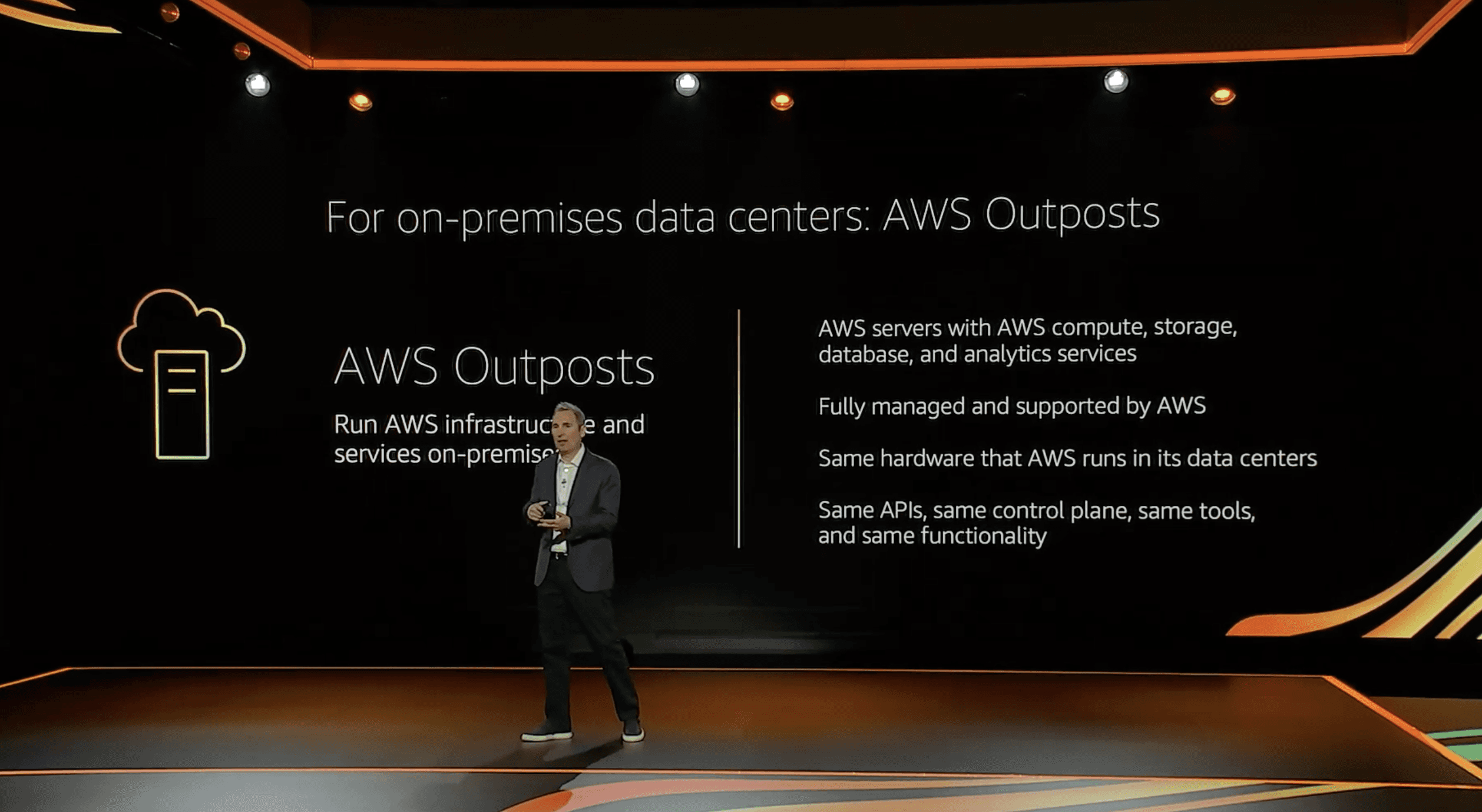
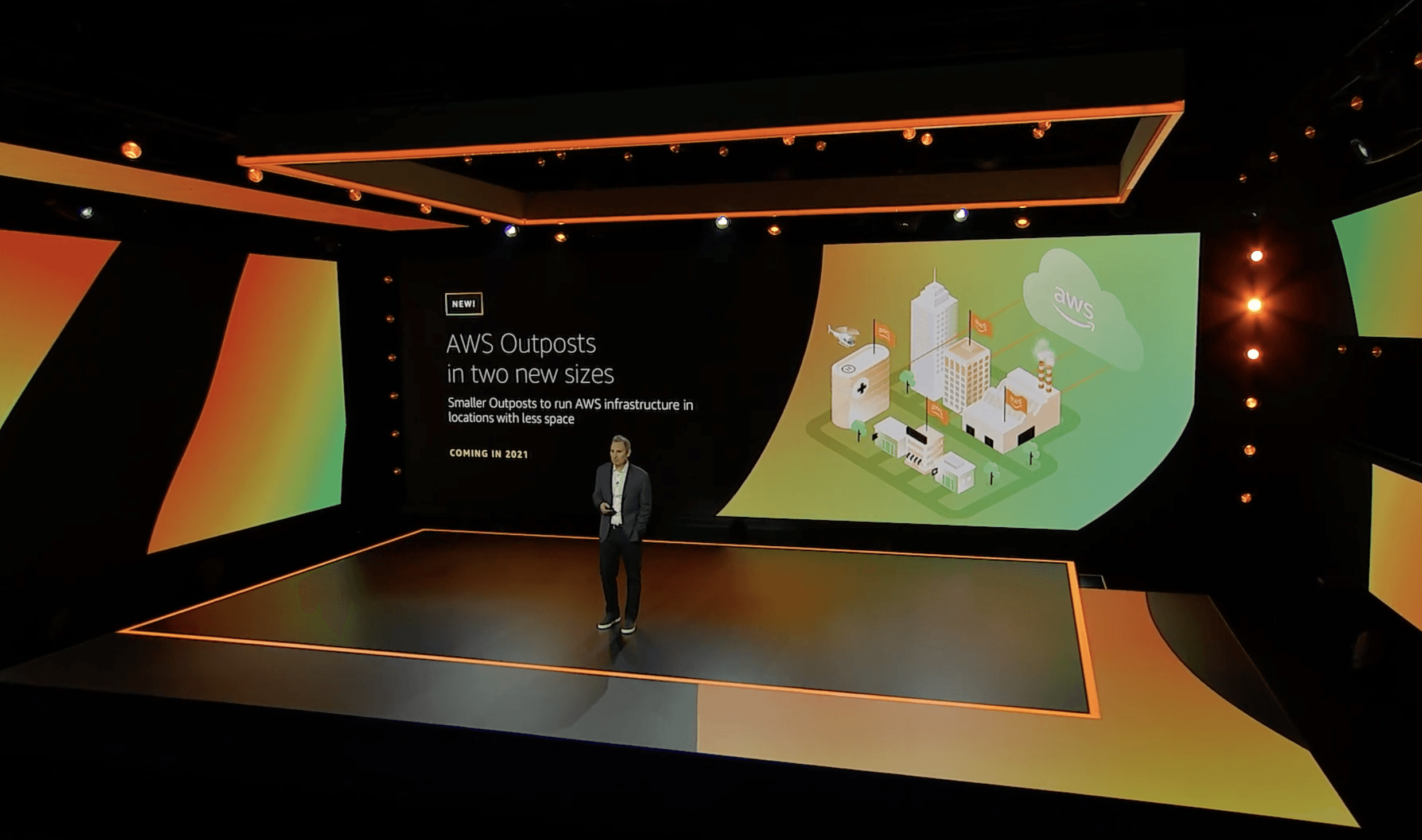

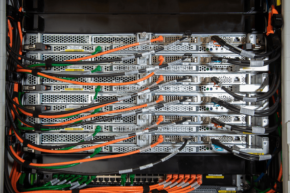
From 2024-2025, I owned the end-to-end customer experience for AWS Outposts, a service that extends AWS infrastructure into customer data centers.
When a 1, 3, or 5-year term ends, customers must decide whether to renew, move to month-to-month, or return the hardware.
I led design for that end-of-term experience, transforming a complex, support-driven workflow into a clear, self-service path.
From 2024-2025, I owned the end-to-end customer experience for AWS Outposts, a service that extends AWS infrastructure into customer data centers.
When a 1, 3, or 5-year term ends, customers must decide whether to renew, move to month-to-month, or return the hardware.
I led design for that end-of-term experience, transforming a complex, support-driven workflow into a clear, self-service path.
Problem
Problem
Two options, zero self-service
Two options, zero self-service

Prior to this launch, if a customer wanted to renew or return an Outpost, they had to contact support, open a support ticket, and coordinate the process through multiple stakeholders and a stream of emails. A process that should take minutes took weeks.
That created a bad experience at exactly the wrong moment. These are high consequence decisions involving infrastructure, contracts, billing, and live workloads.
What should have felt clear and procedural felt vague, slow, and risky.
Prior to this launch, if a customer wanted to renew or return an Outpost, they had to contact support, open a support ticket, and coordinate the process through multiple stakeholders and a stream of emails. A process that should take minutes took weeks.
That created a bad experience at exactly the wrong moment. These are high consequence decisions involving infrastructure, contracts, billing, and live workloads.
What should have felt clear and procedural felt vague, slow, and risky.
Discovery
Discovery
Visualizing the problem
Visualizing the problem
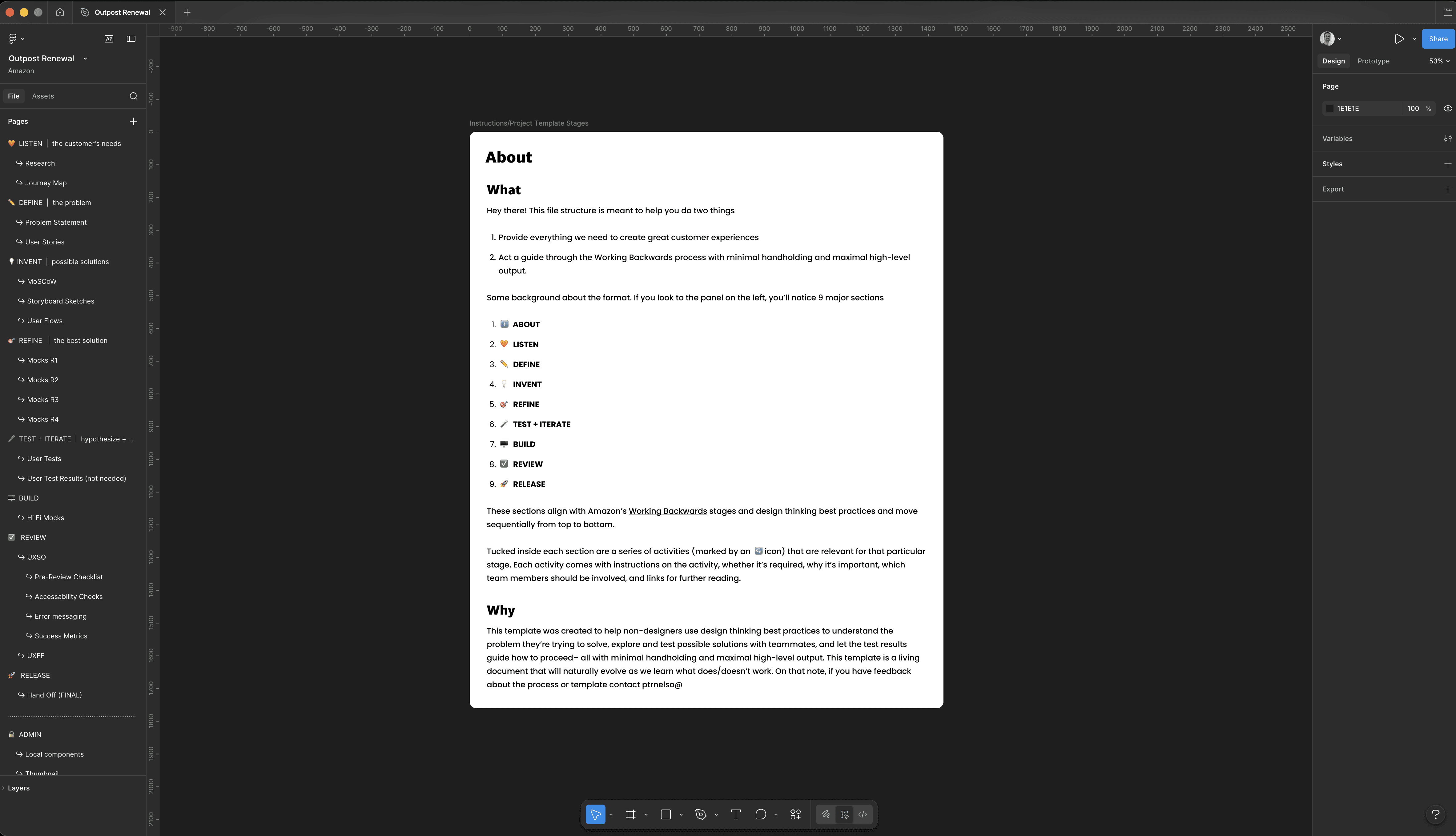
All of my projects live in a Figma template I built from the ground up. This template serves two primary purposes:
Provides everything we need to create great customer experiences inside a single source of truth.
Acts as a guide through both design thinking and Amazon’s "Working Backwards" process with minimal handholding and maximal high-level output.
The template is organized into eight stages, from listening to release. Each stage has embedded activities, instructions, and ownership. The structure gives team members, particularly non-designers, just enough scaffolding to move fast while staying focused on the core problem.
All of my projects live in a Figma template I built from the ground up. This template serves two primary purposes:
Provides everything we need to create great customer experiences inside a single source of truth.
Acts as a guide through both design thinking and Amazon’s "Working Backwards" process with minimal handholding and maximal high-level output.
The template is organized into eight stages, from listening to release. Each stage has embedded activities, instructions, and ownership. The structure gives team members, particularly non-designers, just enough scaffolding to move fast while staying focused on the core problem.
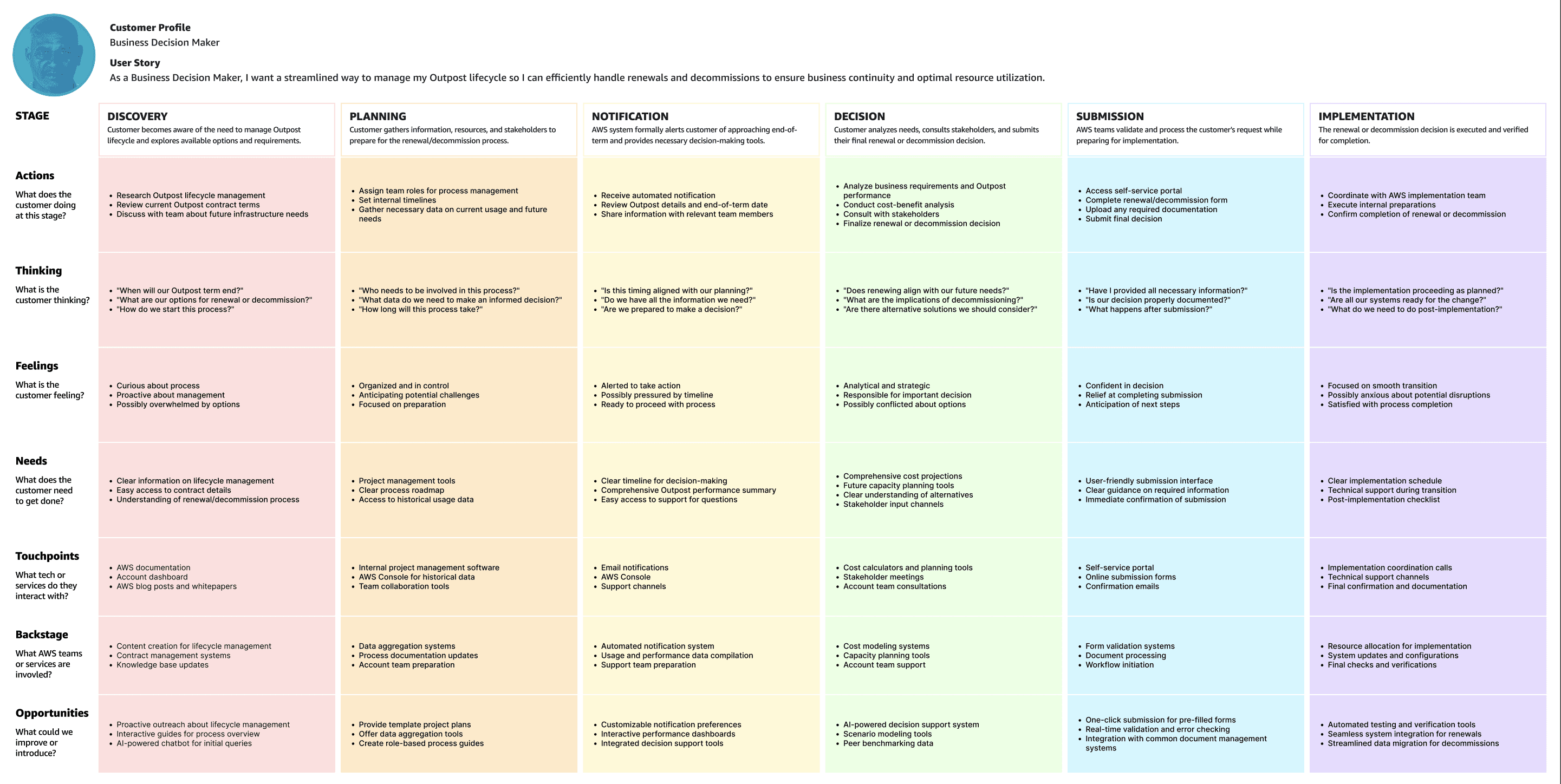
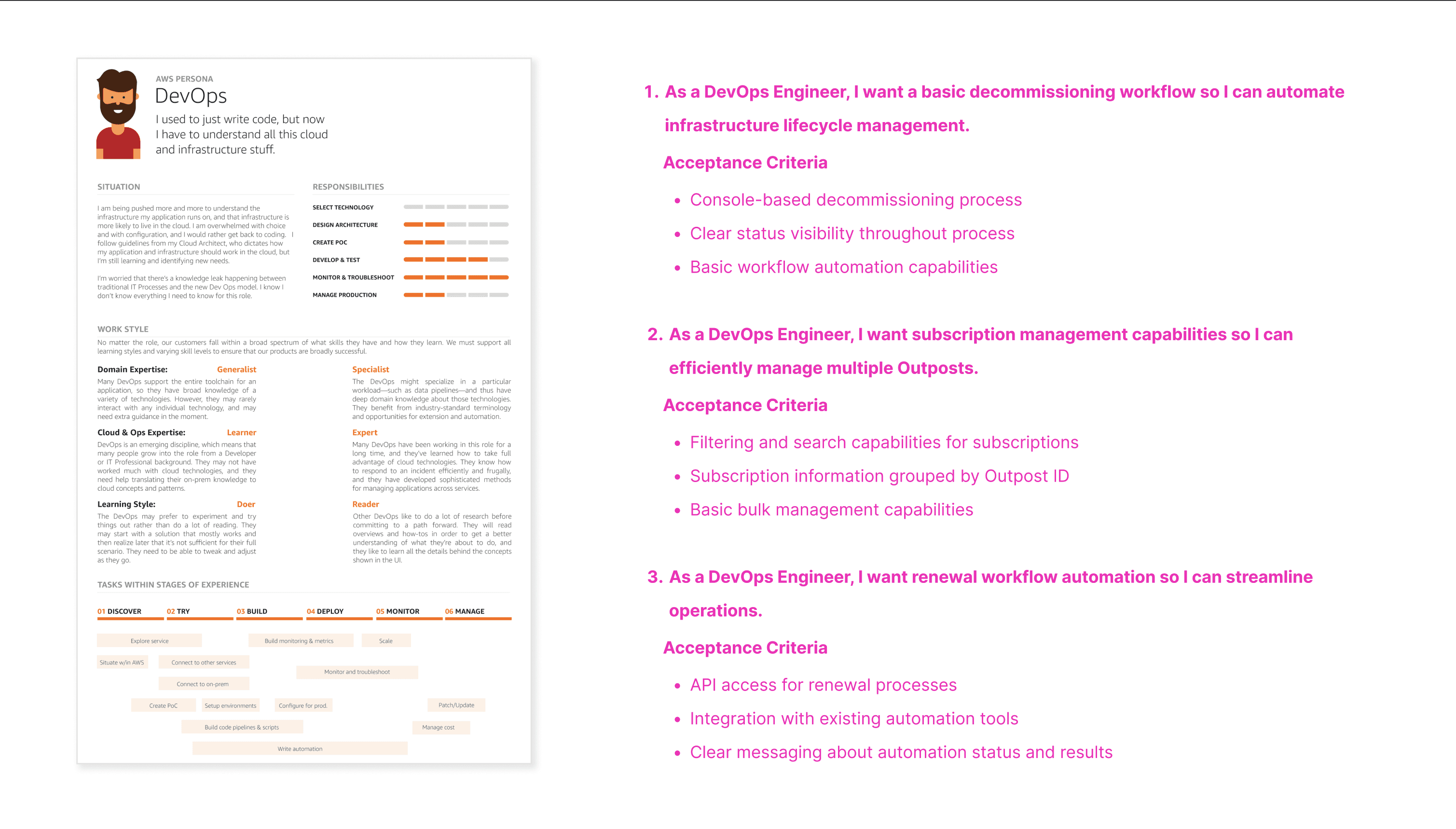
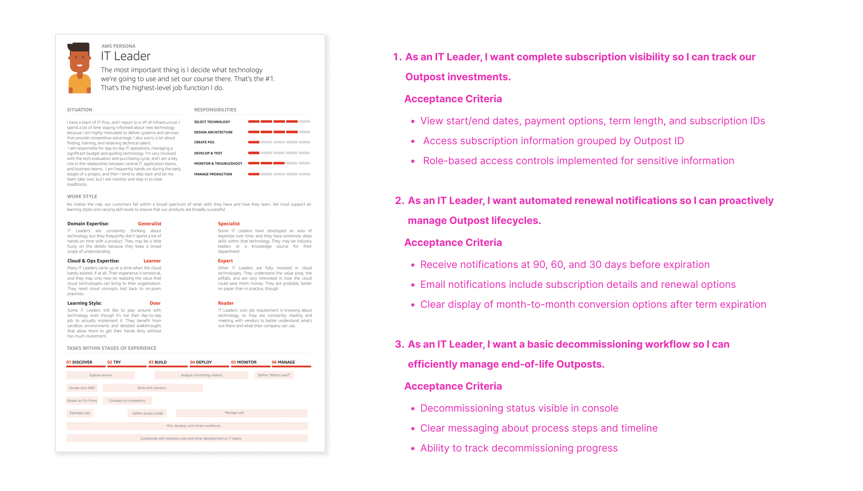
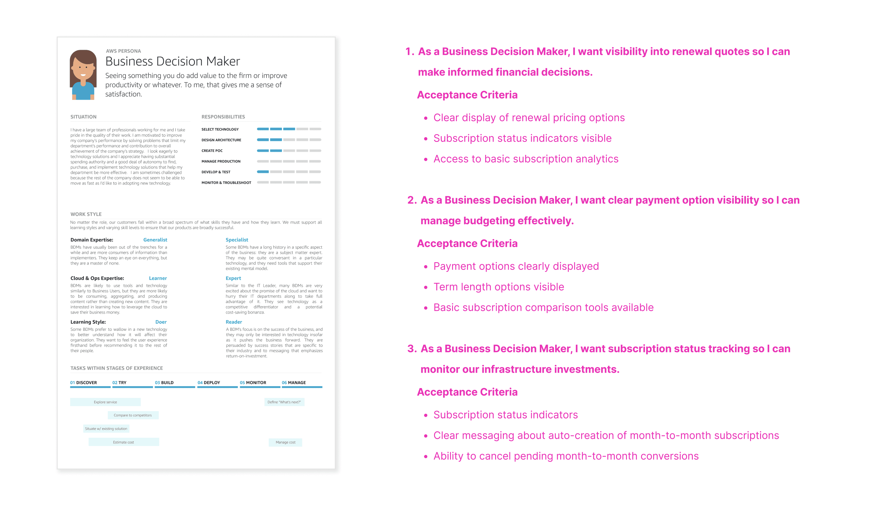
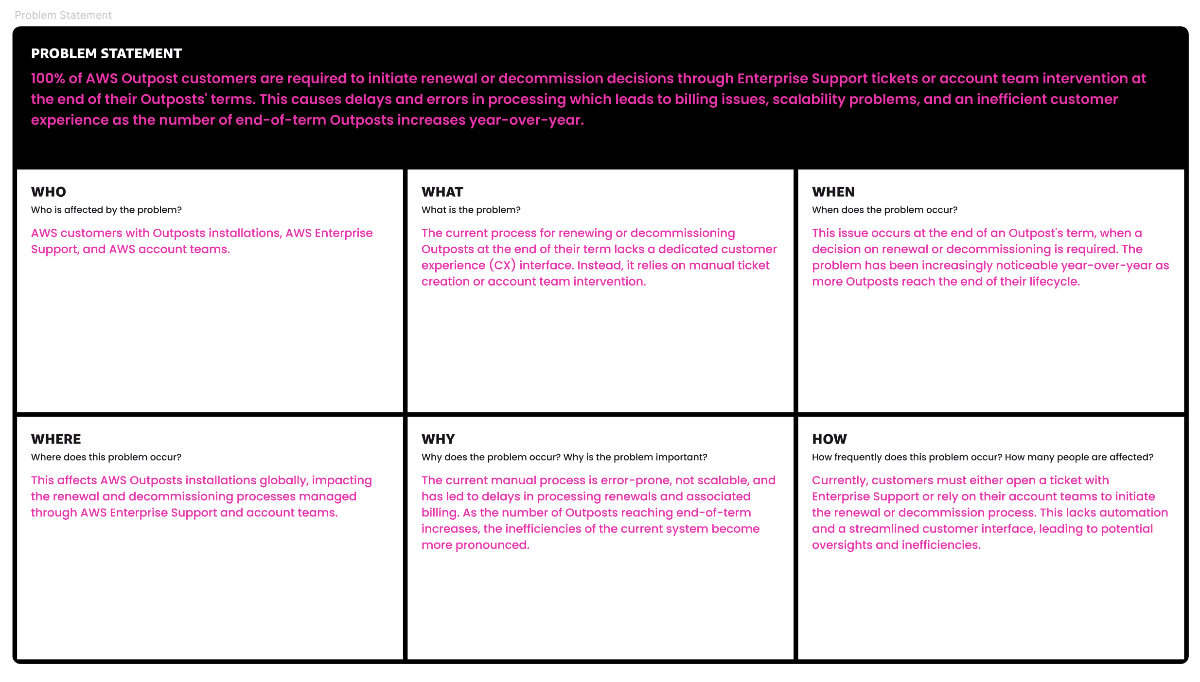
I begin every project by listening to the customer.
Using customer interviews, support tickets, and service metrics, I mapped the targeted persona and created a journey map for the end-of-term experience. What I found confirmed the hunch. The primary barrier wasn't technical complexity. It was psychological. Users felt blind in the manual process, fearing a mistake would either delete mission-critical data or lock them into a contract they weren't ready for.
With the persona and journey map in hand, I wrote a problem statement and user story that gave the team a shared reference point for every decision that followed. The solution needed to provide functional automation and, equally as important, emotional reassurance.
I begin every project by listening to the customer.
Using customer interviews, support tickets, and service metrics, I mapped the targeted persona and created a journey map for the end-of-term experience. What I found confirmed the hunch. The primary barrier wasn't technical complexity. It was psychological. Users felt blind in the manual process, fearing a mistake would either delete mission-critical data or lock them into a contract they weren't ready for.
With the persona and journey map in hand, I wrote a problem statement and user story that gave the team a shared reference point for every decision that followed. The solution needed to provide functional automation and, equally as important, emotional reassurance.
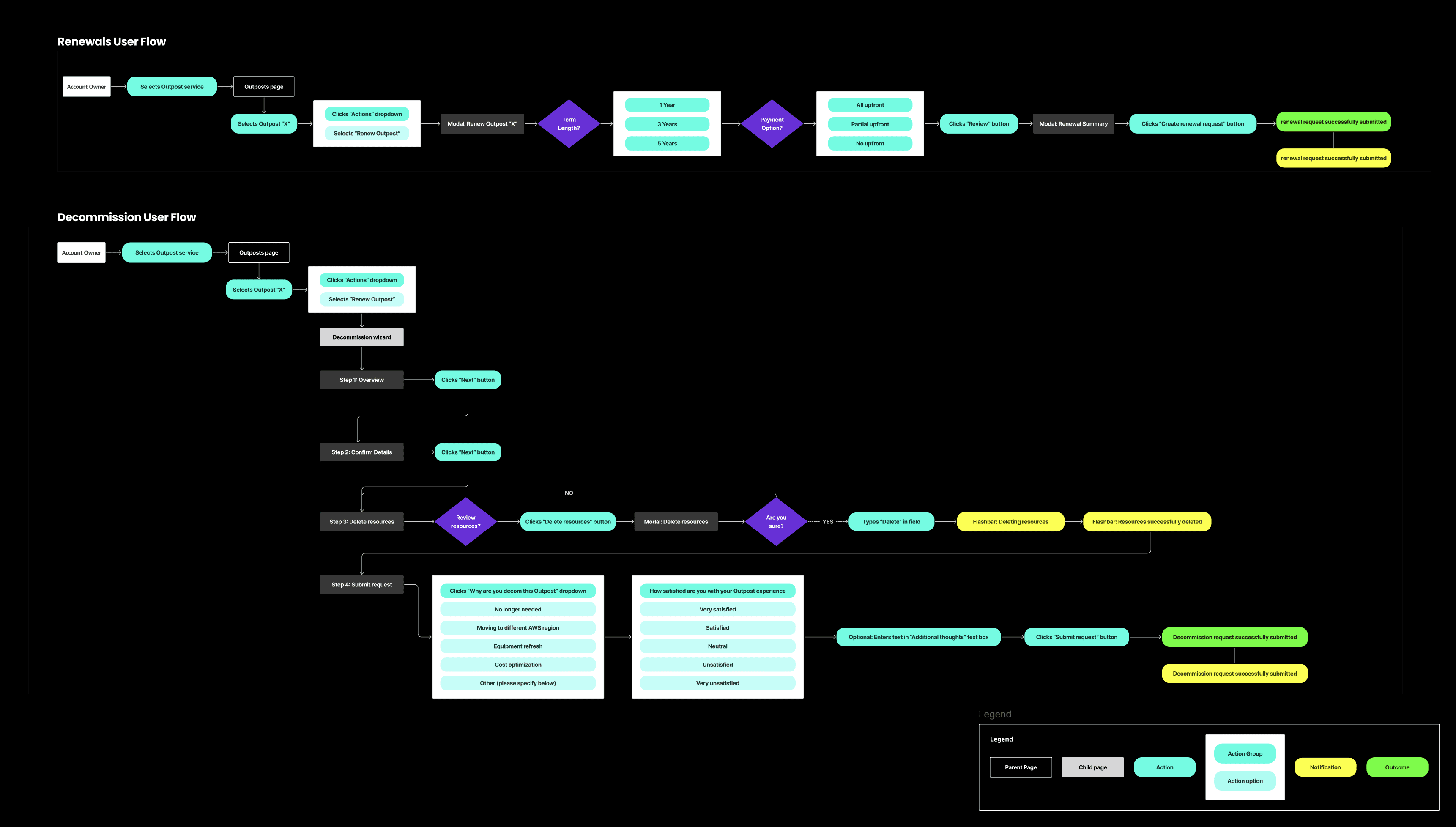
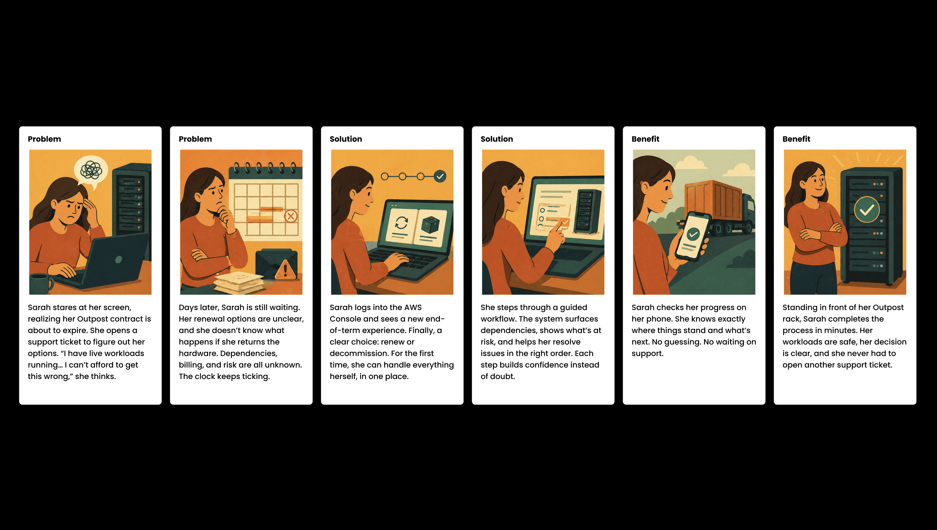
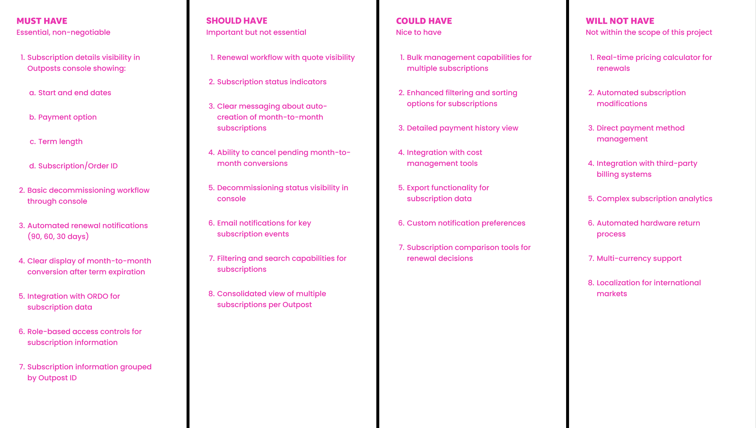
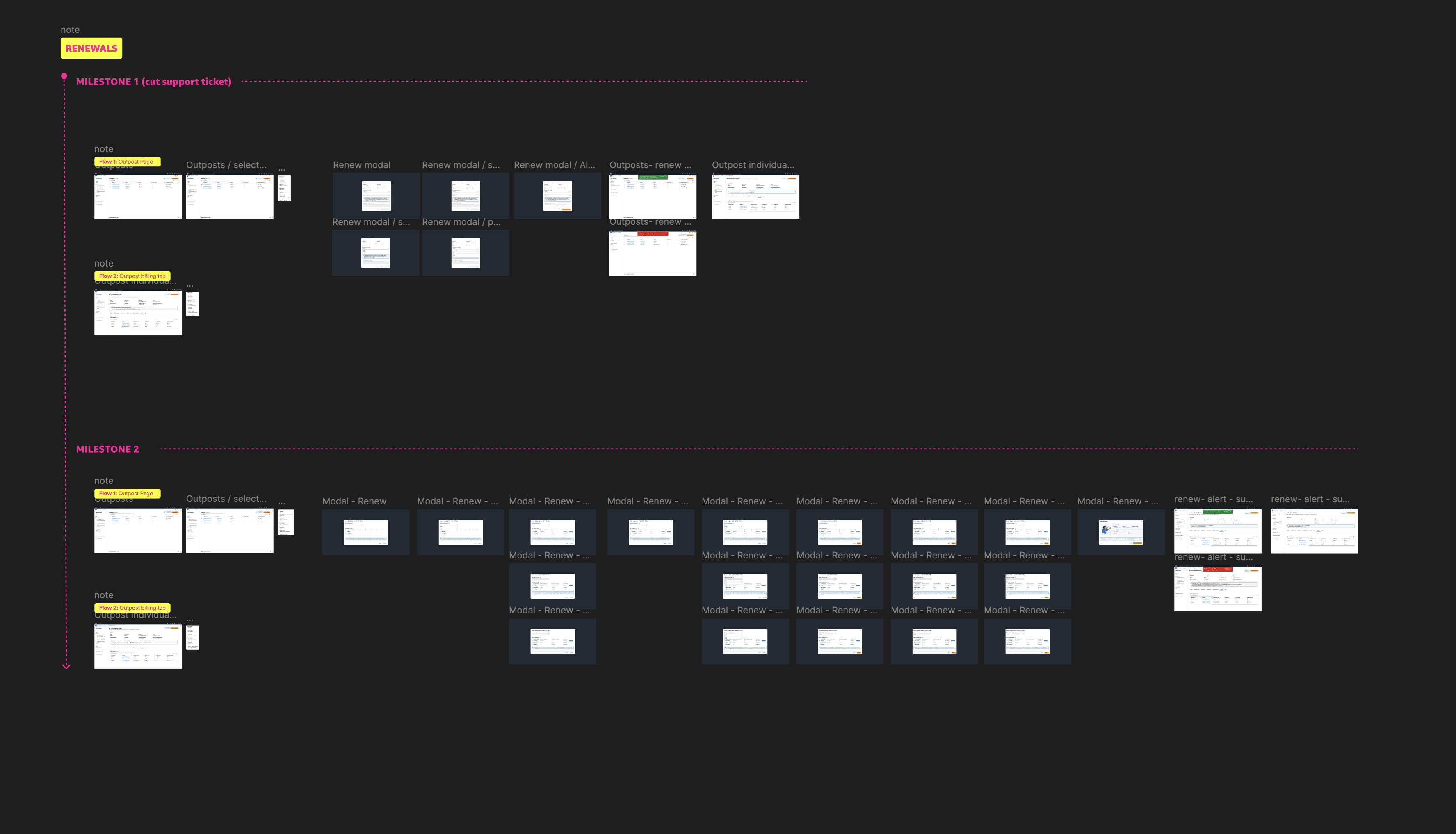
With the problem defined, I worked with the team to explore solutions. We used the MoSCoW framework to prioritize what the product must, should, could, and would not include. I created storyboards to ground the team in the customer’s experience, then mapped end-to-end user flows to make every step explicit.
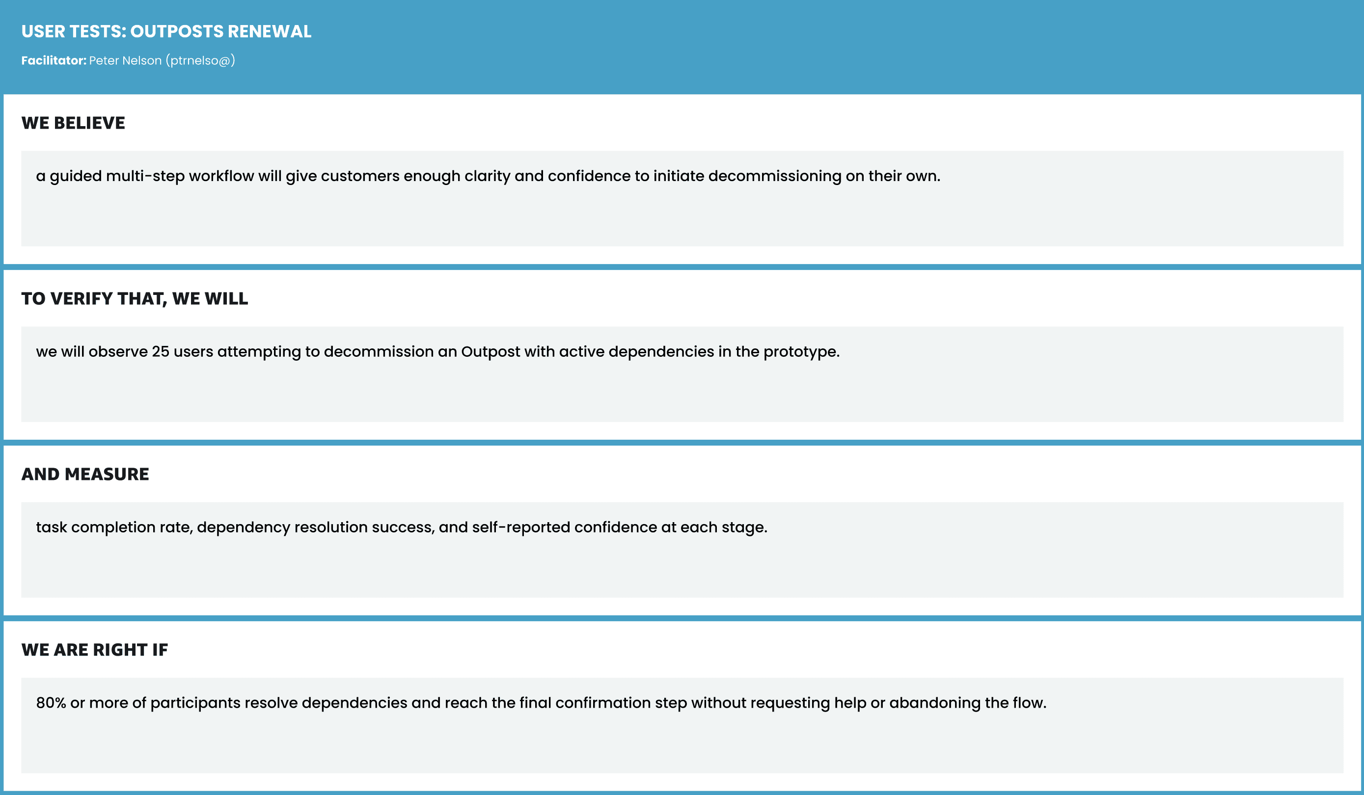
From there, I built a clickable prototype and tested it with real users. Before the study, I defined our hypothesis, method, and success criteria in a simple test plan so we knew exactly what we were validating and how to measure it.
With the problem defined, I worked with the team to explore solutions. We used the MoSCoW framework to prioritize what the product must, should, could, and would not include. I created storyboards to ground the team in the customer’s experience, then mapped end-to-end user flows to make every step explicit.
From there, I built a clickable prototype and tested it with real users. Before the study, I defined our hypothesis, method, and success criteria in a simple test plan so we knew exactly what we were validating and how to measure it.
Solution
Solution
One entry point, two guided paths
One entry point, two guided paths
With validated results, I worked with our PM and lead engineers to write a requirements doc, then built high fidelity mocks. The solution had two clear paths: renew or decommission.
Renewals let customers compare terms and move forward in-product.
Decommissioning guided users through dependencies, resolving them step by step before safely shutting down.
The experience combined clear decision points, system feedback, and status visibility. Customers understood exactly what would happen before taking action.
To reduce anxiety, I introduced custom illustrations at key moments. They weren’t decorative. They were there to reduce cognitive load and make the process feel a bit more human.
Before release, I ran accessibility checks, developed error messaging and success metrics, and presented the work to our internal design committee for UX Sign Off.
With validated results, I worked with our PM and lead engineers to write a requirements doc, then built high fidelity mocks. The solution had two clear paths: renew or decommission.
Renewals let customers compare terms and move forward in-product.
Decommissioning guided users through dependencies, resolving them step by step before safely shutting down.
The experience combined clear decision points, system feedback, and status visibility. Customers understood exactly what would happen before taking action.
To reduce anxiety, I introduced custom illustrations at key moments. They weren’t decorative. They were there to reduce cognitive load and make the process feel a bit more human.
Before release, I ran accessibility checks, developed error messaging and success metrics, and presented the work to our internal design committee for UX Sign Off.
Impact
Impact
From weeks to minutes
From weeks to minutes
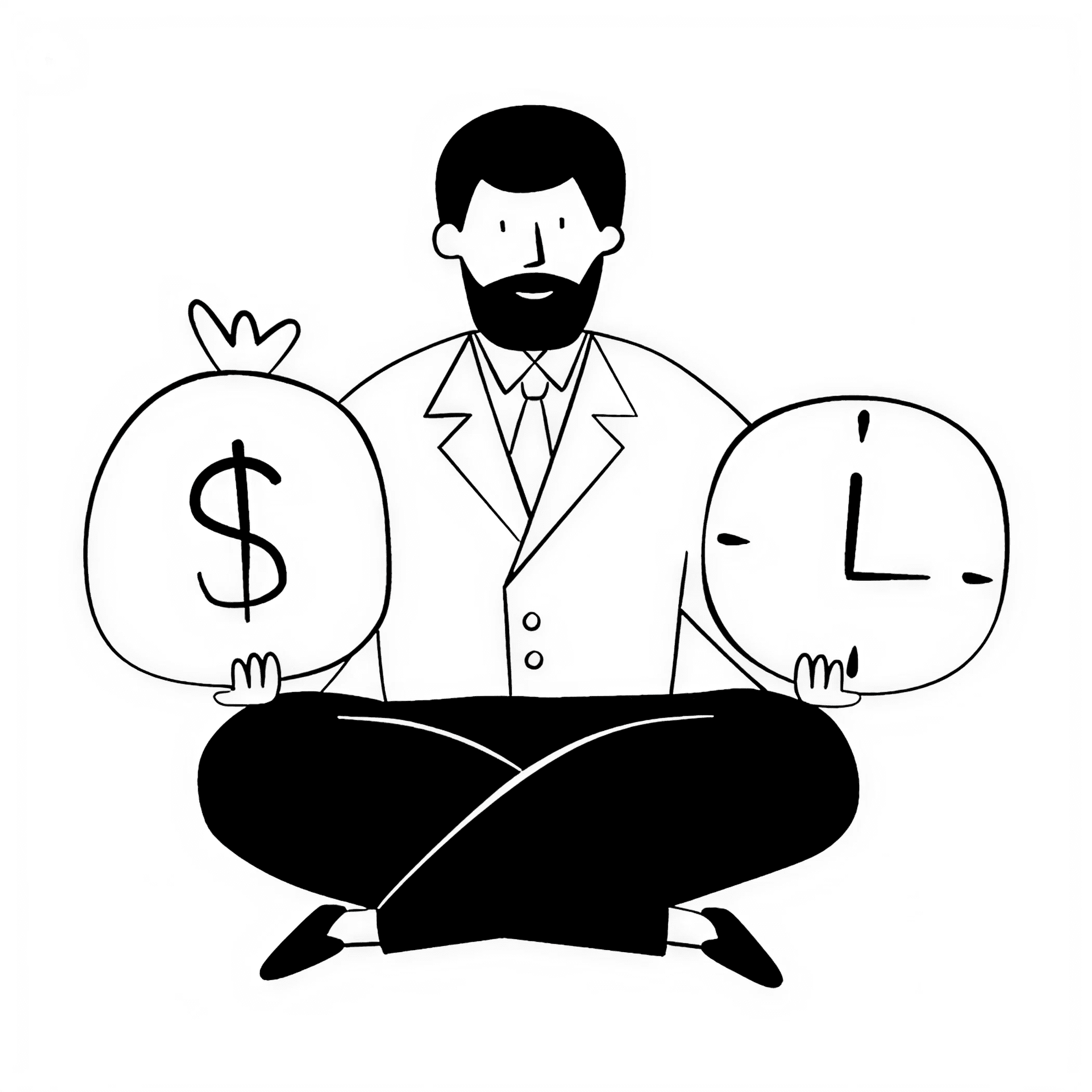
This work moved a painful, support-heavy lifecycle event into the product itself.
The result was a self service flow that reduced a process that previously took multiple weeks to less than five minutes for the customer to complete. It also aimed to reduce support dependency and operational overhead at scale.
Key success metrics:
• 99%+ reduction in time-to-completion, from an average 2+ weeks to under 5 minutes
• 80% reduction in support tickets, reclaiming hundreds of hours for AWS account teams
• <5% total error rate
This work moved a painful, support-heavy lifecycle event into the product itself.
The result was a self service flow that reduced a process that previously took multiple weeks to less than five minutes for the customer to complete. It also aimed to reduce support dependency and operational overhead at scale.
Key success metrics:
• 99%+ reduction in time-to-completion, from an average 2+ weeks to under 5 minutes
• 80% reduction in support tickets, reclaiming hundreds of hours for AWS account teams
• <5% total error rate
This work moved a painful, support-heavy lifecycle event into the product itself.
The result was a self service flow that reduced a process that previously took multiple weeks to less than five minutes for the customer to complete. It also aimed to reduce support dependency and operational overhead at scale.
Key success metrics:
• 99%+ reduction in time-to-completion, from an average 2+ weeks to under 5 minutes
• 80% reduction in support tickets, reclaiming hundreds of hours for AWS account teams
• <5% total error rate
Reflection
Reflection
Designing for the human, not just the admin
Designing for the human, not just the admin

Before this project, Outpost end-of-term decision were a black box. Customers had no visibility, no control, and no way to act without calling someone. Ugh.
This project wasn't just about creating a UI, it was about building trust. The illustrations, the dependency checklist, the step-by-step confirmation. None of it was technically complex. But it was the difference between a customer feeling confident enough to act on their own and a customer abandoning the flow to call support.
One account lead told me it was the first time a customer completed end-of-term without filing a ticket. That’s success.
Before this project, Outpost end-of-term decision were a black box. Customers had no visibility, no control, and no way to act without calling someone. Ugh.
This project wasn't just about creating a UI, it was about building trust. The illustrations, the dependency checklist, the step-by-step confirmation. None of it was technically complex. But it was the difference between a customer feeling confident enough to act on their own and a customer abandoning the flow to call support.
One account lead told me it was the first time a customer completed end-of-term without filing a ticket. That’s success.
Working on this project is a reminder that sometimes the most important design decisions happen below the surface. The banner is simple.
The hard part is the metadata schema underneath it, and getting hundreds of service teams to describe their features the same way. It's a systems problem.
When should a recommendation appear? When should it stay quiet? When should it never come back? Those decisions get made in the schema, not the UI.
Let’s chat
© 2026